Where's My Truck?
conceptual design for local food trucks app
Role
Lead UX Designer
Tools
Figma, Miro, & Photoshop
Duration
2 weeks


Overview
A conceptual scheduling app for food trucks to help bring more returning customers back to food trucks in the area. Restaurant locations have more information available on wait times, availability and pre-ordering, and it would be beneficial to incorporate those abilities into a food truck app. There are a few indirect/direct competitors that are limited in the amount of service they provide, and it is Where's My Truck?'s goal to minimize that gap.
The Problem
In the U.S. in 2022, there were more than 4 restaurants per 1 food truck. There are over 150,000 restaurants in the U.S., compared to just over 35,000 food trucks. Being able to locate and order from trucks similar to how you would from a restaurant will help bring food trucks more customers, and connect their customers with local vendors.
The Approach
I conducted user research and implemented design techniques to create a conceptual app that is easy to navigate for different types of users who are interested in visiting and supporting local food trucks.
Discovery
Research
A competitive audit was conducted to research 3 similar services available to consumers online. These services included Truckster, Streetfood Finder and Roaming Hunger. Website content, visual design and interaction/user flow were analyzed to discover successful components for each site. Research into the differences between the availabilities and services provided by brick and mortar restaurants versus 'on the go' food trucks was conducted to gain a better understanding of the potential needs of users.
Synthesis
Understanding the User
Through research and user interviews, personas were created to symbolize users needs for the service. The most common need found in different types of potential users, was convenience and ease of use.

Goals
-
to have an app that shows where the food trucks that are currently open in the area are and how long their line is, so that I can plan where to go on my limited lunch break
-
I also need to be able to find the food trucks with quick service, so I won't be late to my next class or activity
Carl Richards
23
University Student
Philadelphia, PA
1 Dorm Roommate
Full-time Student
Age:
Education:
Hometown:
Family:
Occupation:
Frustrations
-
walking around to find food trucks that are open and short lines wastes time
-
I end up having to opt for unhealthy fast food chains or have to skip lunch all-together if I spend too much time looking for somewhere to get food from
"As a full-time student with a busy schedule and no kitchen of my own, I need an app that shows where trucks will be during the week so that I can plan my lunches in between classes."
"It is important to me to have an app that provides me with the current wait time and location of the local food trucks in the area. As a college student with no kitchen and a busy schedule, I need to be able to plan and know where I am getting food from before I leave for my lunch break. It is important to me to be able to utilize this app to be efficient in planning my lunches, so that I don't miss any school obligations."
Visualizing Design Ideas
Sketching Ideas
After interviewing and establishing a persona, I started to sketch out both big picture and close-up storyboards to get an idea of the user's process while using the app.

Big Picture
Close Up

After working out the task flow, I began sketching layout ideas for wireframes, taking into account ease of use and filtering options to easily find what user's are looking for. It was important to establish a sense of confidence in finding trucks, loading the menu and ordering.

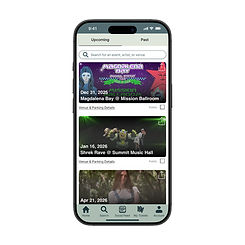
Wireframes

Low Fidelity Prototype

Usability Testing
I conducted usability tests with 3 users, taking notes on their ability to easily find a truck, add items to their cart and check out.
Task Click Path Observations Quotes Task Completion
Prompt 1: From the home screen, hit the search icon on the bottom navigation bar, allow the app to track location, and pick a food truck to order from that offers pre-order.
Prompt 2: Start an order from a truck that offers pre-order
Prompt 3: Confirm your order and pick-up time, and complete the check out process
Prompt 4: How would you improve the process of finding a food truck?
Click Home Icon>Click Search Icon>Allow app to access location>Apply Filters>Look for Trucks with + to pre-order
Click Start Order>Browse menu and add items>Click check out as guest and proceed
Add in payment info and press 'place order'
N/A
- user felt a little overwhelmed with the homepage and where to go first
- took a moment for user to understand which trucks are available for preorder
- user didn't know where to go to see cart at first
- user slightly confused by lack of 'confirm' button, and instead just a 'place order' button
- user wishes map feature was more intuitive
- user wishes there was a confirm page before placing an order
"There's a lot going on, on the homepage. I'm not sure where to start"
"I like the stagnant bar on the bottom with the major functions of the app, I think that is a good anchor for people that get confused"
"Where do I go once I add things to my cart?"
"The cart is a little small and out of the way, I wish it was more obvious when things get added to my cart"
"It would be convenient to have some sort of points system, although maybe that's missing since I checked out as a guest"
"It seems a little abrupt to put in all of the info and then just hit place order instead of seeing a confirmation beforehand"
Easy to complete
Difficult to complete
Difficult to complete
N/A
I found several trends through this testing, helping shape the overall flow of each part of the app.

streamline and simplify map and search functions
enhance accessibility by enlarging icons and photos
include full separate confirmation page
Usability Findings
User Pain Points
1
Map & Search
created a larger and more distinct search function so the users have an option of how they wish to look for trucks
2
Photos
created larger photos that are easier for users to see; consider clickable photos that enlarge to the screen size
3
Homepage
some users found the homepage overwhelming; broke up content on homepage to help guide users
4
Ordering Process
some users found the ordering process too abrupt; created more calls to action and indicators of each step until confirmation
Before Study

After Study

there should be an added section for users to save their favorites, for easy ordering
there should be points that users can accumulate for deals from trucks
weekly schedules for trucks should be added so users can plan ahead
icons and photos should be larger so that users are able to see them clearly and navigate easily
map page should be broken up more so the search function is larger and easier to use
there should be an added confirmation page so the ordering process is not abrupt
Round 1
Round 2
Validating Design Decisions
Clearer indicators on the homepage allow for users to have a less overwhelming initial impression, and confidence in where to click next.
Separating the search and map functions allow for clearer distinction to the user and guides them to their next step in finding a truck.


Finalizing Flow

Takeaways
Throughout this project, I learned how to present my ideas to potential users, test their ability to use the product and made improvements based upon feedback.
"this app allows you to locate open food trucks in the area, like how you would for restaurants. I love checking out what trucks are in the area and even ordering ahead so I can fit it into my schedule."
- user quote