LUCI
streamlined onboarding for Naviday Health's ios women's health app
Client
Role
UX/UI Designer on a 5-member team responsible for end-to-end design contributions, maintaining high-fidelity visual system consistency and image curation aligned with product and client goals.
Tools
Figma, Figjam, Google Sheets & Photoshop
Timeline
3.5 weeks


Overview
"Our platform empowers individuals to navigate life’s most personal health transitions—starting with menopause—through a personalized, AI-guided menopause care plan. With the LUCI App, you can track daily symptoms, uncover meaningful patterns, and confidently take action, backed by insights designed to support your health in real time."
Our Task
To create an onboarding flow that gets users set up in the fewest pages and least time, so they feel confident and grounded right away when using the app.
Research
Identifying Opportunities
Before our team's influence, the registration process for LUCI included many personal questions upfront and was not fully functional.

Register Now


Create an Account
Competitive Analysis
We conducted competitive analyses of the onboarding process of several similar apps. MyFitnessPal and Noom are both major competitors for LUCI, so we analyzed the flow from the user's perspective. To do this, our team conducted onboarding audits, focusing on dividing the major parts of onboarding into three parts: initial registration, showing a brief overview of what the app does, and lastly, information collection. Focusing on the feeling of familiarity to provide the users with confidence and reassurance, we implemented a similar flow to help guide the users through the onboarding flow in a timely manner.
Noom Onboarding Audit

.....long information collection process.....
~35% - 10 out of 29 screens dedicated to information collection
MyFitnessPal Onboarding Audit

........................................long information collection process.........................................
~55% - 16 out of 29 screens dedicated to information collection
User Interviews
We conducted structured in-person and video call interviews with 8 individuals ranging from ages 42 to 73. During these interviews, we noted several points of frustration in each individual's health journey, and the expressed need for a better, more connected system overall. We gathered targeted information about onboarding, long term health transitions, and their menopause experience specifically.
Research Synthesis
Affinity Mapping
After conducting these interviews, we converted all quotes into stickies to affinity map. First, we all did an individual timed run through of affinity mapping. Then, we affinity mapped as a group to identify common themes and takeaways.
Individual

As a Group

-
"I find some health app onboarding processes to be confusing, tedious and difficult"
-
"I find current healthcare apps and tools difficult to use"
-
"I feel overwhelmed and not confident about discussing my medical issues with my provider."
-
"I feel as there is a lack of information."
-
"I realized I had to advocate for my own health"
Findings
88% felt unsupported by the healthcare system throughout menopause
75% specifically felt dismissed or ignored in relation to symptoms by healthcare providers
88% use devices/tools to track and manage their symptoms, do their own research and self-advocate
Meet Sarah

Needs
-
Clear guidance to manage complex health info
-
One place to organize medications, symptoms & labs
-
Better communication with doctors
-
Support that feels human, not overwhelming
Frustrations
-
Frustration peaks with the system itself
-
Hates the long, technical, and tedious onboarding questionnaires
-
Felt "completely abandoned and absolutely adrift"
56• Post-menopause • High BP & Cholesterol
Like Sarah, many individuals are going through long-term health transitions and are frustrated with the current “help systems” in place. While most of the women we spoke to do their own research, prepare questions ahead of time for their doctors and self-advocate, the lack of support and confidence remains.
From Friction to Flow
Usability Testing
We tested 6 users total (age 52-80), conducting moderated in-person and zoom call testing. Taking notes of confusion and pain points, as well as time spent on each page. Our goal was to identify pain points for completing onboarding in the least amount of time with the least amount of pages.
We encountered several friction points in this process:
Sign Up (1 Page)
-
1 min 14 s
Optional Care Plan Intake Form (1 page)
-
1 min 56 s
a 10 - question menopause form was removed from onboarding and moved inside the app to reduce stress and fatigue while onboarding. This helped automatically reduce the onboarding process almost 2 minutes.
Care Plan Overview (1 Page)
-
1 min 54 s
Total (12 pages)
-
5 min 15 s
Taking feedback into account throughout this entire process, we updated flows accordingly and confirmed changes with our client Naviday Health, to ensure we were moving in the correct direction.
Results
Sign Up Page
Feedback
-
Confusion with using Facebook, Google or Apple to register
-
Trouble getting ‘Sign Up’ button to function
Key Takeaways
-
Remove additional registering options
-
Add space around ‘Sign Up’ button to make it easier to click

Tested Version 1
Updated Version 2
Care Plan Page
Feedback
-
Unclear which plans are available
-
Confusion with clicking multiple options and functionality skip vs. continue (83% of participants tried to click multiple plans)
Key Takeaways
-
Clarify which plans are currently available and which step comes next in the onboarding process

Tested Version 1
Updated Version 2
Final Flow
The streamlined, final flow that took the onboarding process from over 5 minutes for users to complete, to just 1 minute and 11 seconds.

Task Flow Iterations (12 total)
We spent the most time as a team working through the information collection portion of the onboarding process. We found out early on that it was a major friction point in the onboarding process, and extended it way more than what was necessary. This was imperative for us to figure out, because users are much less likely to complete onboarding if it is too lengthy.
The task flow went through 12 iterations, and after 2 usability tests, we found what information was absolutely needed for the minimum viable product. We introduced a conversational-style step-by-step approach that reduced decision fatigue for the user.
The reduction of information collection (shown in green and circled in orange) can be seen after both rounds of usability tests.
Before Usability Tests


After Usability Tests Round 1 & 2
After the first usability test, the information collection portion of the onboarding process was reduced to only the information needed for the minimum viable product. Several screens were also marked as optional to give the user full choice over the length of onboarding.


Takeaways
Collaborating with the client and running two rounds of usability tests, we reduced the amount of information collection upfront, taking the onboarding process from being completed in an average of 5 minutes and 15 seconds to 1 minute and 11 seconds.
LoFi Flow
Highlighting the significantly shortened information collection process

Bringing the Design to Life
Our client provided a style guide that Naviday Health utilizes for brand consistency. My main responsibility for this section of the project was maintaining the typeface standards that Naviday provided. While working through many iterations of color combinations provided to us for the prototype, we found that there were some issues with accessibility. After running a few accessability tests on our prototype, we found that amplifying some of the tones helped tremendously with the ease of visibility on each page.

Standard Typefaces for Naviday
Standard Colors for LUCI
New Colors for LUCI (approved by client)
Streamlined Initial Information Collection


Clear Distinction of Available Plans
After usability testing and a redesign of the Care Plan page, we utilized the color palette to create more guidance for the user to know exactly where to click next.

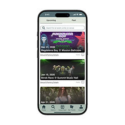
In an effort to maintain visual consistency within the app, I took the opportunity to redesign the LUCI dashboard to match the onboarding flow. This creates a cohesive feeling for the user once they enter the app officially, and minimizes their feelings of doubt and confusion.

Original LUCI Dashboard

Updated LUCI Dashboard
HiFi Prototype

Next Steps for LUCI
In the next several phases for LUCI, Naviday plans to add additional plans. Such as cardiovascular and weight management plans. These will follow the same structure as the menopause plan. The onboarding process will serve as a source of guidance and comfort for users no matter which plan(s) they choose.