
Natalie Harrington
Landmark Cinema
Role
UX & UI research & design
Tools
Figma, Miro, & Photoshop
Duration
2 weeks
Goal
create a conceptual seat reservation flow for a trendy movie theater website, with corresponding landing page for smartphone app
Project Overview
A conceptual seat reservation flow for a trendy movie theater, Landmark Cinema. This website enables users to view what new and upcoming movies are available, and purchase tickets in advance.
Users are not currently able to reserve seats in advance when visiting Landmark Cinema and are not able to link account info to their tickets for future points/promotions.
The Challenge
To create a website that allows users to easily browse through new movies available, reserve seats and purchase tickets, and save their information to accumulate points for promotions.
The Approach
Design Process
Empathize
Competitive Audit
User Research
User Interviews
Define
User Journey Map
Personas
Ideate
User Flow
Information Architecture
Design
Wireframes
Mockups
Prototypes
Test
Usability Studies
Refine Designs
Empathize
User Research
Competitive Audit

Define
Persona

Rebecca M.
Age: 36
Education: Bachelor's
Hometown: Queens, NY
Family: Husband and 1 child
Occupation: Interior Designer
"As an avid movie lover who has a busy schedule, I would like a site that allows me to browse new movies and reserve seats for myself and my family."
Goals
an efficient seat reservation system that is easy to use to book tickets in advance
ability to easily search for new and upcoming movies
"As a busy working mom, I love to end the week at the movies with my family. I work more than 40 hours a week and need to be able to easily reserve tickets in advance for a show so I don't have to worry about waiting in line after a long week."
Frustrations
waiting in line to find out the movie is now sold out or there aren't enough seats next to each other
not being able to get tickets in advance to avoid waiting in line
Ideate
Seat Reservation Flow Chart
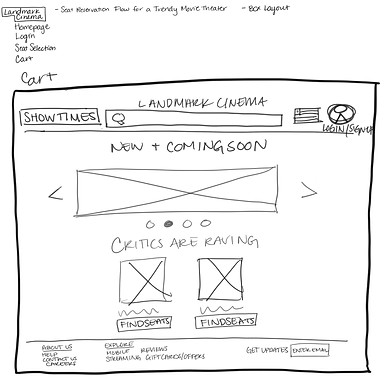
Homepage
Search
Filter
Movies showing this week
Upcoming movies this month
Genre
Log in/Sign up
Cart
Log in
Forgot username or password?
Create account
Order summary
Payment
Checkout
Footer
Directions
About Us
Help
Contact Us
Design
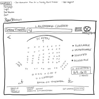
Paper Wireframes


Digital Wireframes
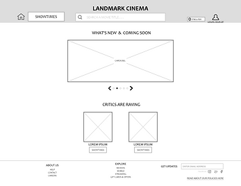


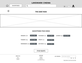


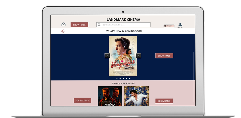
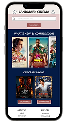
A responsive design approach was followed to show how the elements adjust when switching from a laptop to a mobile device
Low-Fidelity Prototype

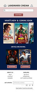
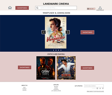
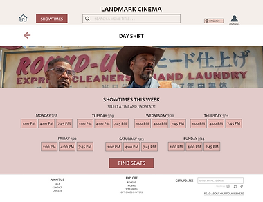
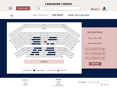
Digital Mockup
home screen for mobile users


High-Fidelity Prototype
